


macos_ui
Flutter widgets and themes implementing the current macOS design language.
Check out our interactive widget gallery online at https://macosui.github.io/macos_ui/#/
Guides, codelabs, and other documentation can be found at https://macosui.dev


🚨 Usage notes
<img src="https://storage.googleapis.com/cms-storage-bucket/0dbfcc7a59cd1cf16282.png" height="14"/> Flutter channel
macos_ui is developed against Flutter's stable channel. To ensure a smooth development experience with macos_ui, you should build your application on Flutter's stable channel.
<img src="https://storage.googleapis.com/cms-storage-bucket/0dbfcc7a59cd1cf16282.png" height="14"/> Platform Compatibility
pub.dev shows that macos_ui only supports macOS. This is because macos_ui calls some native code, and therefore
specifies macOS as a plugin platform in the pubspec.yaml file.
macos_ui technically will work on any platform that
Flutter supports, but you will get best results on macOS. non-macOS platform support is not guaranteed.
The features of macos_ui that will not work on platforms other than macOS due to calling native code are:
- Anything related to
macos_window_utils - The
MacosColors.controlAccentColor()function - The
MacosColorWellwidget
<img src="https://imgur.com/TIP0V7H.png" height="14"/> Popups & window resizing
Since at this time Flutter does not allow UI elements to overflow the bounds of the window, popups are constrained to the available space.
Therefore, if you are using widgets that create popups in your toolbar, like ToolBarPopupButton, you
should avoid allowing your application window to be resized below the height of your tallest popup.
Contents
<details> <summary>Contributing & Resources</summary> </details> <details> <summary>Layout</summary> </details> <details> <summary>Icons</summary> </details> <details> <summary>Buttons</summary> </details> <details> <summary>Dialogs & Sheets</summary> </details> <details> <summary>Fields & Labels</summary> </details> <details> <summary>Indicators</summary> </details> <details> <summary>Selectors</summary> </details>Contributing
macos_ui welcomes contributions! Please see CONTRIBUTING.md for more information.
Resources
Layout
MacosWindow
MacosWindow is the basic frame for a macOS-style layout.
It supports a Sidebar on the left, an optional TitleBar at the top, and the rest of the window is typically filled out
with a MacosScaffold.
A scope for the MacosWindow is provided by MacosWindowScope.
The sidebar can be toggled with MacosWindowScope.of(context).toggleSidebar(). Please note that you must wrap
your MacosScaffold in a Builder widget in order for this to work properly.
Sidebar
A sidebar enables app navigation and provides quick access to top-level collections of content in your app.
Sidebars may be placed at the left or right of your app. To place a sidebar on the left, use the MacosWindow.sidebar property. To place a sidebar on the right, use the MacosWindow.endSidebar property.
Example usage:
int pageIndex = 0;

...

MacosWindow(
  sidebar: Sidebar(
    minWidth: 200,
    builder: (context, scrollController) {
      return SidebarItems(
        currentIndex: pageIndex,
        scrollController: scrollController,
        itemSize: SidebarItemSize.large,
        onChanged: (i) {
          setState(() => pageIndex = i);
        },
        items: const [
          SidebarItem(
            label: Text('Page One'),
          ),
          SidebarItem(
            label: Text('Page Two'),
          ),
        ],
      );
    },
  ),
  endSidebar: Sidebar(
    startWidth: 200,
    minWidth: 200,
    maxWidth: 300,
    shownByDefault: false,
    builder: (context, _) {
      return const Center(
        child: Text('End Sidebar'),
      );
    },
  ),
),
MacosScaffold
The MacosScaffold is what you might call a "page".
The scaffold has a toolbar property and a children property. children accepts a ContentArea widget and
multiple ResizablePane widgets. To catch navigation or routes below the scaffold, consider wrapping the
MacosScaffold in a CupertinoTabView.
By doing so, navigation inside the MacosScaffold will be displayed inside the MacosScaffold area instead of
covering the entire window. To push a route outside a MacosScaffold wrapped in a
CupertinoTabView, use the root navigator
Navigator.of(context, rootNavigator: true)
See the documentation for customizations and ToolBar examples.
Modern window look
A new look for macOS apps was introduced in Big Sur (macOS 11). To match that look in your Flutter app, macos_ui relies on macos_window_utils, which requires a minimum macOS deployment target of 10.14.6. Therefore, make sure to open the macos/Runner.xcworkspace folder of your project using Xcode and search for Runner.xcodeproj. Go to Info > Deployment Target and set the macOS Deployment Target to 10.14.6 or above. Then, open your project's Podfile (if it doesn't show up in Xcode, you can find it in your project's macos directory via VS Code) and set the minimum deployment version in the first line to 10.14.6 or above:
platform :osx, '10.14.6'
You may also need to open up your app's Runner.xcodeproj in XCode and set the minimum deployment version there.
Now, configure your window inside your main() as follows:
/// This method initializes macos_window_utils and styles the window.
Future<void> _configureMacosWindowUtils() async {
  const config = MacosWindowUtilsConfig(
    toolbarStyle: NSWindowToolbarStyle.unified,
  );
  await config.apply();
}

void main() async {
  await _configureMacosWindowUtils();

  runApp(const YourAppHere());
}
Please note that if you are using a title bar (TitleBar) in your MacosWindow, you should set the toolbarStyle of your window to NSWindowToolbarStyle.expanded, in order to properly align the close, minimize, zoom window buttons:
Future<void> _configureMacosWindowUtils() async {
  const config = MacosWindowUtilsConfig(
    toolbarStyle: NSWindowToolbarStyle.expanded,
  );
  await config.apply();
}
In any other case, you should keep it as NSWindowToolbarStyle.unified.
ToolBar
Creates a toolbar in the MacosScaffold. The toolbar appears below the title bar (if present) of the macOS app or integrates with it, by using its title property.
A toolbar provides convenient access to frequently used commands and features (toolbar items). Different routes of your app could have different toolbars.
Toolbar items include ToolBarIconButton, ToolBarPulldownButton, and ToolBarSpacer widgets, and should be provided via the items property. The action of every toolbar item should also be provided as a menu bar command of your app.
Toolbars look best and are easiest to understand when they contain elements of the same type (so either use labels for every toolbar item or not).
You can use the ToolBarSpacer widgets to set the grouping of the different toolbar actions.
An example toolbar would be:
ToolBar(
  title: const Text('Untitled Document'),
  titleWidth: 200.0,
  leading: MacosBackButton(
    onPressed: () => debugPrint('click'),
    fillColor: Colors.transparent,
  ),
  actions: [
    ToolBarIconButton(
      label: "Add",
      icon: const MacosIcon(
        CupertinoIcons.add_circled,
      ),
      onPressed: () => debugPrint("Add..."),
      showLabel: true,
    ),
    const ToolBarSpacer(),
    ToolBarIconButton(
      label: "Delete",
      icon: const MacosIcon(
        CupertinoIcons.trash,
      ),
      onPressed: () => debugPrint("Delete"),
      showLabel: false,
    ),
    ToolBarPullDownButton(
      label: "Actions",
      icon: CupertinoIcons.ellipsis_circle,
      items: [
        MacosPulldownMenuItem(
          label: "New Folder",
          title: const Text("New Folder"),
          onTap: () => debugPrint("Creating new folder..."),
        ),
        MacosPulldownMenuItem(
          label: "Open",
          title: const Text("Open"),
          onTap: () => debugPrint("Opening..."),
        ),
      ],
    ),
  ]
),
This builds this simple toolbar: <img src="https://imgur.com/BDUdQkj.png"/>
Other toolbar examples:
-
Toolbar with icon buttons (no labels):
<img src="https://imgur.com/PtrjhPx.png"/> -
Toolbar with icon buttons and labels:
<img src="https://imgur.com/Ouaud12.png"/> -
Toolbar with a pulldown button open:
<img src="https://imgur.com/msGmcNY.png"/> -
Toolbar with title bar above (also see the note above):
<img src="https://imgur.com/eAgcsKY.png"/>
You can also create your own CustomToolbarItem to include any type of widget in the toolbar:
// Add a grey vertical line as a custom toolbar item:
CustomToolbarItem(
  inToolbarBuilder: (context) => Padding(
    padding: const EdgeInsets.all(8.0),
    child: Container(color: Colors.grey, width: 1, height: 30),
  ),
  inOverflowedBuilder: (context) =>
      Container(color: Colors.grey, width: 30, height: 1),
),
SliverToolBar
<img src="https://imgur.com/u4LDaxj.gif" width="75%"/>
SliverToolbar is a variant of the standard ToolBar, with the key difference being that (as the name implies), it
is compatible with scrollable widgets like CustomScrollView and NestedScrollView. There are three additional
properties on SliverToolBar:
pinned, which determines if the toolbar should remain visible while scrollingfloating, which determines if the toolbar should become visible as soon as the use starts scrolling upwardsopacity, which manages the translucency effect of the toolbar
This widget enables developers to achieve the toolbar behaviors seen in Apple's App Store.
Sample usage:
return CustomScrollView(
  controller: scrollController,
  slivers: [
    SliverToolBar(
      title: const Text('SliverToolbar'),
      pinned: true,
      toolbarOpacity: 0.75,
    ),
    // Other slivers below
  ],
);
MacosListTile
A widget that aims to approximate the ListTile widget found in
Flutter's material library.
Sample usage:
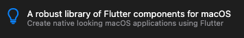
MacosListTile(
  leading: const Icon(CupertinoIcons.lightbulb),
  title: Text(
    'A robust library of Flutter components for macOS',
    style: MacosTheme.of(context).typography.headline,
  ),
  subtitle: Text(
    'Create native looking macOS applications using Flutter',
    style: MacosTheme.of(context).typography.subheadline.copyWith(
      color: MacosColors.systemGrayColor,
    ),
  ),
),
MacosTabView
A multipage interface that displays one page at a time. Must be used in a StatefulWidget.
You can control the placement of the tabs using the position property.
Usage:
final _controller = MacosTabController(
  initialIndex: 0,
  length: 3,
);

...

MacosTabView(
  controller: _controller,
  tabs: const [
    MacosTab(
      label: 'Tab 1',
    ),
    MacosTab(
      label: 'Tab 2',
    ),
    MacosTab(
      label: 'Tab 3',
    ),
  ],
  children: const [
    Center(
      child: Text('Tab 1'),
    ),
    Center(
      child: Text('Tab 2'),
    ),
    Center(
      child: Text('Tab 3'),
    ),
  ],
),
Icons
MacosIcon
A MacosIcon is identical to a regular Icon in every way with one exception - it respects
a MacosTheme. Use it the same way you would a regular icon:
MacosIcon(
  CupertinoIcons.add,
  // color: CupertinoColors.activeBlue.color,
  // size: 20,
),
Buttons
MacosCheckbox
A checkbox is a type of button that lets the user choose between two opposite states, actions, or values. A selected checkbox is considered on when it contains a checkmark and off when it's empty. A checkbox is almost always followed by a title unless it appears in a checklist. Learn more
| Unchecked | Checked | Mixed |
|---|---|---|
| 

扣子-AI办公
职场AI,就用扣子
AI办公助手,复杂任务高效处理。办公效率低?扣子空间AI助手支持播客生成、PPT制作、网页开发及报告写作,覆盖科研、商业、舆情等领域的专家Agent 7x24小时响应,生活工作无缝切换,提升50%效率!


堆友
多风格AI绘画神器
堆友平台由阿里巴巴设计团队创建,作为一款AI驱动的设计工具,专为设计师提供一站式增长服务。功能覆盖海量3D素材、AI绘画、实时渲染以及专业抠图,显著提升设计品质和效率。平台不仅提供工具,还是一个促进创意交流和个人发展的空间,界面友好,适合所有级别的设计师和创意工作者。


码上飞
零代码AI应用开发平台
零代码AI应用开发平台,用户�只需一句话简单描述需求,AI能自动生成小程序、APP或H5网页应用,无需编写代码。


Vora
免费创建高清无水印Sora视频
Vora是一个免费创建高清无水印Sora视频的AI工具


Refly.AI
最适合小白的AI自动化工作流平台
无需编码,轻松生成可复用、可变现的AI自动化工作流


酷表ChatExcel
大模型驱动的Excel数据处理工具
基于大模型交互的表格处理系统,允许用户通过对话方式完成数据整理和可视化分析。系统采用机器学习算法解析用户指令,自动执行排序、公式计算和数据透视等操作,支持多种文件格式导入导出。数据处理响应速度保持在0.8�秒以内,支持超过100万行数据的即时分析。


TRAE编程
AI辅助编程,代码自动修复
Trae是一种自适应的集成开发环境(IDE),通过自动化和多元协作改变开发流程。利用Trae,团队能够更快速、精确地编写和部署代码,从而提高编程效率和项目交付速度。Trae具备上下文感知和代码自动完成功能,是提升开发效率的理想工具。


AIWritePaper论文写作
AI论文写作指导平台
AIWritePaper论文写作是一站式AI论文写作辅助工具,简化了选题、文献检索至论文撰写的整个过程。通过简单设定,平台可快速生成高质量论文大纲和全文,配合图表、参考文献等一应俱全,同时提供开题报告和答辩PPT等增值服务,保障数据安全,有效提升写作效率和论文质量。


博思AIPPT
AI一键生成PPT,就用博思AIPPT!
博思AIPPT,新一代的AI生成PPT平台,支持智能生成PPT、AI美化PPT、文本&链接生成PPT、导入Word/PDF/Markdown文档生成PPT等,内置海量精美PPT模板,涵盖商务、教育、科技等不同风格,同时针对每个页面提供多种版式,一键自适应切换,完美适配各种办公场景。


潮际好麦
AI赋能电商视觉革命,一站式智能商拍平台
潮际好麦深耕服装行业,是国内AI试衣效果最好的软件。使用先进AIGC能力为电商卖家批量提供优质的、低成本的商拍图。合作品牌有Shein、Lazada、安踏、百丽等65个国内外头部品牌,以及国内10万+淘宝、天猫、京东等主流平台的品牌商家,为卖家节省将近85%的出图成本,提升约3倍出图效率,让品牌能够快速上架。
推荐工具精选


AI云服务特惠
懂AI专属折扣关注微信公众号
最新AI工具、AI资讯
独家AI资源、AI项目落地

微信扫一扫关注公众号