Responsive Framework

Responsiveness made simple
The Responsive Framework includes widgets that help developers build responsive apps for mobile, desktop, and website layouts.
Demo
Minimal Website
A demo website built with the Responsive Framework. View Code
Flutter Website
The flutter.dev website recreated in Flutter. View Code
Pub.dev Website
The pub.dev website recreated in Flutter. View Code
Quick Start
Import this library into your project:
responsive_framework: ^latest_version
Add ResponsiveBreakpoints.builder to your MaterialApp or CupertinoApp. Define your own breakpoints and labels.
import 'package:responsive_framework/responsive_framework.dart'; class MyApp extends StatelessWidget { Widget build(BuildContext context) { return MaterialApp( builder: (context, child) => ResponsiveBreakpoints.builder( child: child!, breakpoints: [ const Breakpoint(start: 0, end: 450, name: MOBILE), const Breakpoint(start: 451, end: 800, name: TABLET), const Breakpoint(start: 801, end: 1920, name: DESKTOP), const Breakpoint(start: 1921, end: double.infinity, name: '4K'), ], ), initialRoute: "/", ); } }
Use the labels you defined for layouts and values.
// Example: if the screen is bigger than the Mobile breakpoint, build full width AppBar icons and labels.
if (ResponsiveBreakpoints.of(context).largerThan(MOBILE))
    FullWidthAppBarItems()

// Booleans
ResponsiveBreakpoints.of(context).isDesktop;
ResponsiveBreakpoints.of(context).isTablet;
ResponsiveBreakpoints.of(context).isMobile;
ResponsiveBreakpoints.of(context).isPhone;

// Conditionals
ResponsiveBreakpoints.of(context).equals(DESKTOP)
ResponsiveBreakpoints.of(context).largerThan(MOBILE)
ResponsiveBreakpoints.of(context).smallerThan(TABLET)
ResponsiveBreakpoints.of(context).between(MOBILE, TABLET)
...
Customization
You can define your own breakpoint labels and use them in your conditionals.
For example, if you're building a Material 3 Navigation Rail and want to expand the menu to full width once there is enough room, you can add a custom EXPAND_SIDE_PANEL breakpoint.
breakpoints: [
  ...
  const Breakpoint(start: 801, end: 1920, name: DESKTOP),
  const Breakpoint(start: 900, end: 900, name: 'EXPAND_SIDE_PANEL') <- Custom label.
  const Breakpoint(start: 1921, end: double.infinity, name: '4K'),
  ...
]
Then, in your code, show the Rail based on the breakpoint condition.
expand: ResponsiveBreakpoints.of(context).largerThan('EXPAND_SIDE_PANEL')
Responsive Framework Widgets
The ResponsiveFramework includes a few custom widgets that supplement Flutter's responsive capabilities. Their usages are showcased in the demo projects.
Legacy ReadMe (v0.2.0 and below)
ResponsiveWrapper Migration
The remainder of the legacy ReadMe is preserved below as the concepts are still useful and used by the new widgets. ResponsiveWrapper has been deprecated and removed.
The Problem
Supporting multiple display sizes often means recreating the same layout multiple times. Under the traditional Bootstrap approach, building responsive UI is time consuming, frustrating and repetitive. Furthermore, getting everything pixel perfect is near impossible and simple edits take hours.

The Solution
Use Responsive Framework to automatically scale your UI.
ResponsiveBreakpoint.autoScale(600);
AutoScale

AutoScale shrinks and expands your layout proportionally, preserving the exact look of your UI. This eliminates the need to manually adapt layouts to mobile, tablet, and desktop.
ResponsiveBreakpoint.autoScale(600);
Flutter's default behavior is resize which Responsive Framework respects. AutoScale is off by default and can be enabled at breakpoints by setting autoScale to true.
Breakpoints

Breakpoints control responsive behavior at different screen sizes.
ResponsiveWrapper(
    child,
    breakpoints: [
        ResponsiveBreakpoint.resize(600, name: MOBILE),
        ResponsiveBreakpoint.autoScale(800, name: TABLET),
        ResponsiveBreakpoint.autoScale(1200, name: DESKTOP),
    ],
)
Breakpoints give you fine-grained control over how your UI displays.
Introductory Concepts
These concepts helps you start using the Responsive Framework and build an responsive app quickly.
Scale vs Resize
Flutter's default behavior is to resize your layout when the screen dimensions change. Resizing a layout stretches it in the direction of an unconstrained width or height. Any constrained dimension stays fixed which is why mobile app UIs look tiny on desktop. The following example illustrates the difference between resizing and scaling.

An AppBar widget looks correct on a phone. When viewed on a desktop however, the AppBar is too short and the title looks too small. Here is what happens under each behavior:
- Resizing (default) - the AppBar's width is double.infinity so it stretches to fill the available width. The Toolbar height is fixed and stays 56dp.
- Scaling - the AppBar's width stretches to fill the available width. The height scales proportionally using an aspect ratio automatically calculated from the nearest
ResponsiveBreakpoint. As the width increases, the height increases proportionally.
When scaled, the AppBar looks correct on desktop, up to a certain size. Once the screen becomes too wide, the AppBar starts to appear too large. This is where breakpoints come in.
Breakpoint Configuration
To adapt to a wide variety of screen sizes, set breakpoints to control responsive behavior.
ResponsiveWrapper(
    child,
    maxWidth: 1200,
    minWidth: 480,
    defaultScale: true,
    breakpoints: [
        ResponsiveBreakpoint.resize(480, name: MOBILE),
        ResponsiveBreakpoint.autoScale(800, name: TABLET),
        ResponsiveBreakpoint.resize(1000, name: DESKTOP),
        ResponsiveBreakpoint.autoScale(2460, name: '4K'),
    ],
)
An arbitrary number of breakpoints can be set. Resizing/scaling behavior can be mixed and matched.
- below 480: resize on small screens to avoid cramp and overflow errors.
- 480-800: resize on phones for native widget sizes.
- 800-1000: scale on tablets to avoid elements appearing too small.
- 1000+: resize on desktops to use available space.
- 2460+: scale on extra large 4K displays so text is still legible and widgets are not spaced too far apart.
Additional Resources
Resocoder Tutorial
The wonderful people at Resocoder created a great tutorial video and article walking through the usage of the Responsive Framework at the link below.
View Responsive Framework Tutorial
Project Wiki
No project wiki exists yet unfortunately. That means this is an opportunity for you to create and maintain the wiki for one of the most popular Flutter packages. This package needs your help with documentation!
Please reach out via the contact links below if you are interested.
About
Responsive Framework was created out of a desire for a better way to manage responsiveness. The ability to automatically adapt UI to different sizes opens up a world of possibilities. Here at Codelessly, we're building a Flutter app UI and website builder, development tools, and UI templates to increase productivity. If that sounds interesting, you'll want to subscribe to updates below 😎
Responsive Framework is licensed under Zero-Clause BSD and released as Emailware. If you like this project or it helped you, please subscribe to updates. Although it is not required, you might miss the goodies we share!
<a href="https://codelessly.com/?utm_medium=banner&utm_campaign=newsletter_subscribe" target="_blank"><img src="https://raw.githubusercontent.com/Codelessly/ResponsiveFramework/master/packages/Email%20Newsletter%20Signup.png"></a>
Badges 🏆
Now you can proudly display the time and headache saved by using Responsive Framework with a supporter's badge.
[](https://github.com/Codelessly/ResponsiveFramework)
<img alt="Built with Responsive Framework" src="https://raw.githubusercontent.com/Codelessly/ResponsiveFramework/master/packages/Built%20with%20Responsive%20Badge.png"/><a href="https://github.com/Codelessly/ResponsiveFramework"> <img alt="Built Responsive" src="https://raw.githubusercontent.com/Codelessly/ResponsiveFramework/master/packages/Built%20Responsive%20Badge.png"/> </a>
<a href="https://github.com/Codelessly/ResponsiveFramework">
  <img alt="Built with Responsive Framework"
       src="https://raw.githubusercontent.com/Codelessly/ResponsiveFramework/master/packages/Built%20with%20Responsive%20Badge.png"/>
</a>
Contributors ❤️
Design:
Development:
- Ray Li
- Spencer Lindemuth
- add yourself here by contributing
Sponsor: Codelessly - Flutter App UI and Website Builder
<a href="mailto:ray@codelessly.com"> <img alt="Codelessly Email" src="https://lh3.googleusercontent.com/yN_m90WN_HSCohXdgC2k91uSTk9dnYfoxTYwG_mv_l5_05dV2CzkQ1B6rEqH4uqdgjA=w96" /> </a> <a href="https://codelessly.com/?utm_medium=icon&utm_campaign=direct"> <img alt="Codelessly Website" src="https://lh3.googleusercontent.com/YmMGcgeO7Km9-J9vFRByov5sb7OUKetnKs8pTi0JZMDj3GVJ61GMTcTlHB7u9uHDHag=w96" /> </a> <a href="https://twitter.com/BuildCodelessly"> <img alt="Codelessly Twitter" src="https://lh3.ggpht.com/lSLM0xhCA1RZOwaQcjhlwmsvaIQYaP3c5qbDKCgLALhydrgExnaSKZdGa8S3YtRuVA=w96" /> </a> <a href="https://github.com/Codelessly"> <img alt="Codelessly GitHub" src="https://lh3.googleusercontent.com/L15QqmKK7Vl-Ag1ZxaBqNQlXVEw58JT2BDb-ef5t2eboDh0pPSLjDgi3-aQ3Opdhhyk=w96" /> </a> <br></br>Flutter is a game-changing technology that will revolutionize not just development, but software itself. A big thank you to the Flutter team for building such an amazing platform 💙
<a href="https://github.com/flutter/flutter"> <img alt="Flutter" src="https://raw.githubusercontent.com/Codelessly/ResponsiveFramework/master/packages/Flutter%20Logo%20Banner.png" /> </a>License
BSD Zero Clause License

Copyright © 2023 Codelessly

Permission to use, copy, modify, and/or distribute this software for any
purpose with or without fee is hereby granted.

THE SOFTWARE IS PROVIDED "AS IS" AND THE AUTHOR DISCLAIMS ALL WARRANTIES WITH
REGARD TO THIS SOFTWARE INCLUDING ALL IMPLIED WARRANTIES OF MERCHANTABILITY
AND FITNESS. IN NO EVENT SHALL THE AUTHOR BE LIABLE FOR ANY SPECIAL, DIRECT,
INDIRECT, OR CONSEQUENTIAL DAMAGES OR ANY DAMAGES WHATSOEVER RESULTING FROM
LOSS OF USE, DATA OR PROFITS, WHETHER IN AN ACTION OF CONTRACT, NEGLIGENCE OR
OTHER TORTIOUS ACTION, ARISING OUT OF OR IN CONNECTION WITH THE USE OR
PERFORMANCE OF THIS
编辑推荐精选


扣子-AI办公
职场AI,就用扣子
AI办公助手,复杂任务高效处理。办公效率低?扣子空间AI助手支持播客生成、PPT制作、网页开发及报告写作,覆盖科研、商业、舆情等领域的专家Agent 7x24小时响应,生活工作无缝切换,提升50%效率!


堆友
�多风格AI绘画神器
堆友平台由阿里巴巴设计团队创建,作为一款AI驱动的设计工具,专为设计师提供一站式增长服务。功能覆盖海量3D素材、AI绘画、实时渲染以及专业抠图,显著提升设计品质和效率。平台不仅提供工具,还是一个促进创意交流和个人发展的空间,界面友好,适合所有级别的设计师和创意工作者。


码上飞
零代码AI应用开发平台
零代码AI应用开发平台,用户只需一句话简单描述需求,AI能自动生成小程序、APP或H5网页应用,无需编写代码。


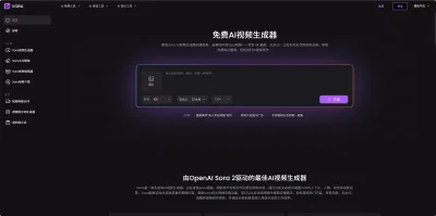
Vora
免费创建高清无水印Sora视频
Vora是一个免费创建高清无水印Sora视频的AI工具


Refly.AI
最适合小白的AI自动化工作流平台
无需编码,轻松生成可复用、可变现的AI自动化工作流


酷表ChatExcel
大模型驱动的Excel数据处理工具
基于大模型交互的表格处理系统,允许用户通过对话方式完成数据整理和可视化分析。系统采用机器学习算法解析用户指令,自动执行排序、公式计算和数据透视等操作,支持多种文件格式导入导出。数据处理响应速度保持在0.8秒以内,支持超过100万行数据的即时分析。


TRAE编程
AI辅助编程,代码自动修复
Trae是一种自适应的集成开发环境(IDE),通过自动化和多元协作改变开发流程。利用Trae,团队能够更快速、精确地编写和部署代码,从而提高编程效率和项目交付速度。Trae具备上下文感知和代码自动完成功能,是提升开发效率的理想工具。


AIWritePaper论文写作
AI论文写作指导平台
AIWritePaper论文写作是一站式AI论文写作辅助工具,简化了选题、文献检索至论文撰写的整个过程。通过简单设定,平台可快速生成高质量论文大纲和全文,配合图表、参考文献等一应俱全,同时提供开题报告和答辩PPT等增值服务,保障数据安全,有效提升写作效率和论文质量。


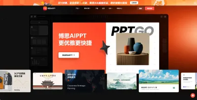
博思AIPPT
AI一键生成PPT,就用博思AIPPT!
博思AIPPT,新一代的AI生成PPT平台,支持智能生成PPT、AI美化PPT、文本&链接生成PPT、导入Word/PDF/Markdown文档生成PPT等,内置海量精美PPT模板,涵盖商务、教育、科技等不同风格,同时针对每个页面提供多种版式,一键自适应切换,完美适配各种办公场景。


潮际好麦
AI赋能电商视觉革命,一站式智能商拍平台
潮际好麦深耕服装行业,是国内AI试衣效果最好的软件。使用先进AIGC能力为电商卖家批量提供优质的、低成本的商拍图。合作品牌有Shein、Lazada、安踏、百丽等65个国内外头部品牌,以及国内10万+淘宝、天猫、京东等主流平台的品牌商家,为卖家节省将近85%的出图成本,提升约3倍出图效率,让品牌能够快速上架。
推荐工具精选
AI云服务特惠
懂AI专属折扣关注微信公众�号
最新AI工具、AI资讯
独家AI资源、AI项目落地

微信扫一扫关注公众号


